LOGO DESIGN
For more than a decade, I've been designing logos and visual identities for businesses across different industries and markets worldwide. I approach logo design as more than creating a distinctive mark. The goal is to develop a visual foundation that is recognizable, appropriate for the business, and flexible enough to work across every application.
From early conceptualization to final delivery, I develop complete logo systems designed for real-world use — with carefully considered logo variations, file formats and configurations for different sizes, backgrounds and applications.
13+ years of experience · Logo design · Brand identity · Visual systems





CASE STUDY:
Solutions2Share GmbH
OVERVIEW
Solutions2Share GmbH is a Microsoft-focused solutions provider operating on a global scale. I have developed their entire branding identity and since 2018, I’ve been supporting their full visual communication system and branding across a wide range of projects.
CHALLENGE
I was approached by them at the very beginning of company's history while they were still a start-up, which allowed us to develop the brand from the ground up, as always, starting with logo design. At that time company didn't have any concept or reference for a possible logo idea, however they did have a description of the company and plan on how to develop their brand, which was more than enough to find a perfect logo. Company's industry is IT, more specifically Microsoft 365 related products and solutions, with a broad pallet of products and services, helping their clients and users in the business management and communication. That meant logo needs to feel modern and smart, but stay abstract enough so it isn't showing anything to specific and symbolic, thereby staying neutral and encompassing large volume of different products.
APPROACH
The logo concept is built around a simple geometric form composed of two symmetrical elements. Together, they create an authentic yet minimalist shape. The shape subtly incorporates the letters “S2S”, a shortened version of the company name, while also suggesting communication, connection, problem-solving and precision.
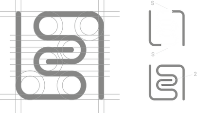
The geometric construction gives the mark a sense of precision, stability and reliability, reinforcing the company's positioning as a competent and dependable technology partner. The lines can also be interpreted as paths through a maze, suggesting navigation, problem-solving and finding solutions — ideas that align naturally with the company's name and its role in helping clients navigate complex business technology.

You are welcome to take a look at more logo examples on my 99designs.com profile.